— Keiarna La Carta, Gentle Currents“Needed someone to help bring to life the vision in my mind…”
“I was feeling overwhelmed and needed someone to help bring to life the vision in my mind. Working with Amy actually helped me get a refined lens for what my brand offered, in a really good way. I felt like I could breathe again knowing someone got me and what my work is about.”
Gentle Currents
Brand identity · Website design + build
A brand and website for a children’s book series and parenting practice
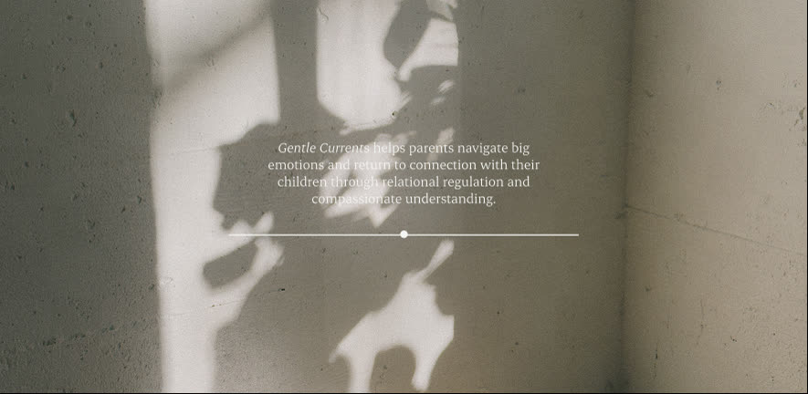
Gentle Currents helps parents navigate big emotions and return to connection with their children through relational regulation and compassionate understanding. Founder Keiarna La Carta is the artist behind the Gentle Currents Stories, a series of children’s books about big feelings, and she wanted the brand to grow into so much more. Senna Studio created a soft, grounded brand and a website, launching soon, that feels like a deep breath: calm, warm and quietly reassuring.
The client
Keiarna La Carta founded Gentle Currents as the artist behind the Gentle Currents Stories. Using gentle, nature-based storytelling, each book explores how feelings move through us and how we find our way back to connection. They’re made for young children and the adults who care for them to read together, opening conversations about big emotions and looking beneath behaviour to what a child is really feeling. Around the books, Gentle Currents supports parents through the hardest moments of family life, helping them find their own calm first so they can meet their children with steadiness and understanding.
The brief
Keiarna came to us with no existing website, brand guidelines or brand photography, and wanted a brand big enough to hold everything she has planned, well beyond the books. Parents often arrive tired and overwhelmed, so it also needed to slow everything down. It had to feel safe, warm and free of judgement, professional enough to trust and gentle enough that reaching out feels easy.
What she said
— Keiarna La Carta, Gentle Currents“Amy is connected, empathetic and present…”
“She helped me get clear on what my brand offered and gave me the confidence to move forward in my direction. I now have a strategy I can work through to launch with care.”
The brand
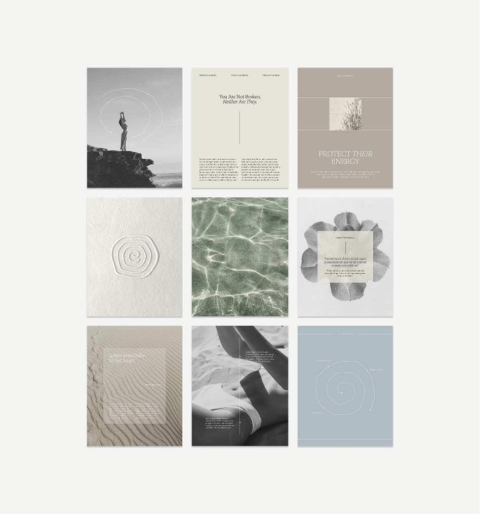
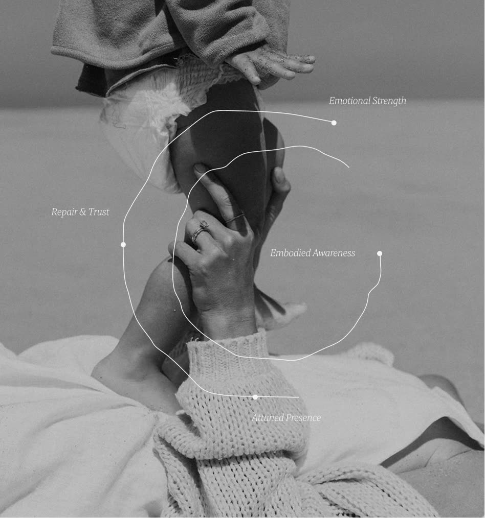
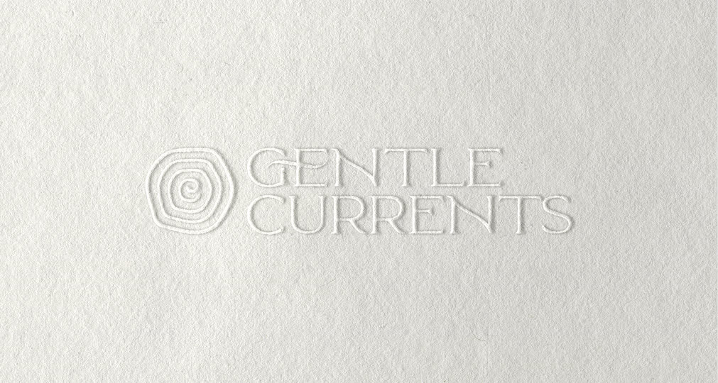
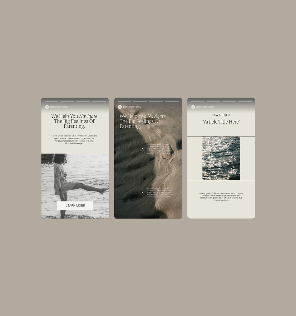
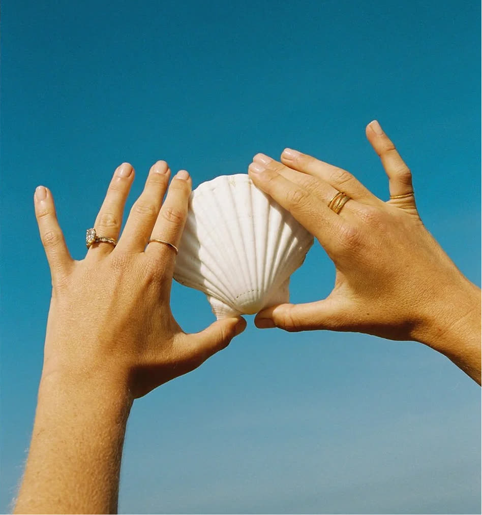
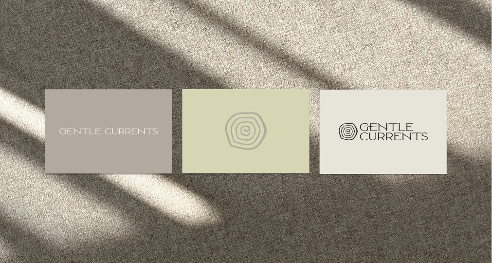
The mark is a set of soft, flowing rings, like ripples spreading across water, echoing the name and the way calm passes from parent to child. Sage, stone and warm grey sit with natural textures, light and shadow, and quiet images of sand, shells and open water, which we sourced to fit the brand, while an airy serif keeps every word gentle.
The website
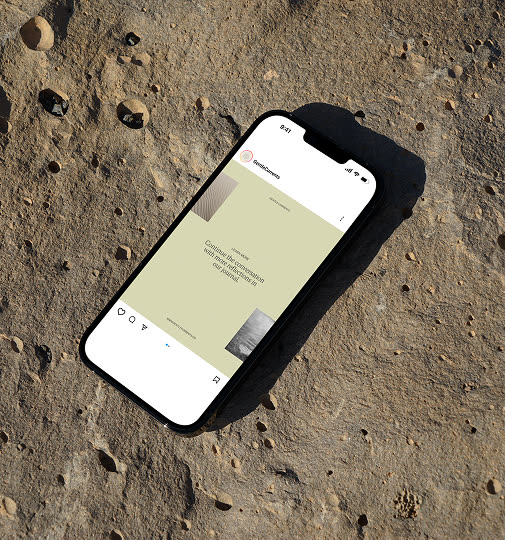
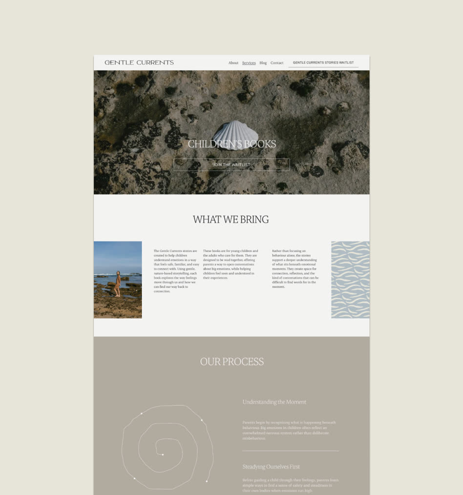
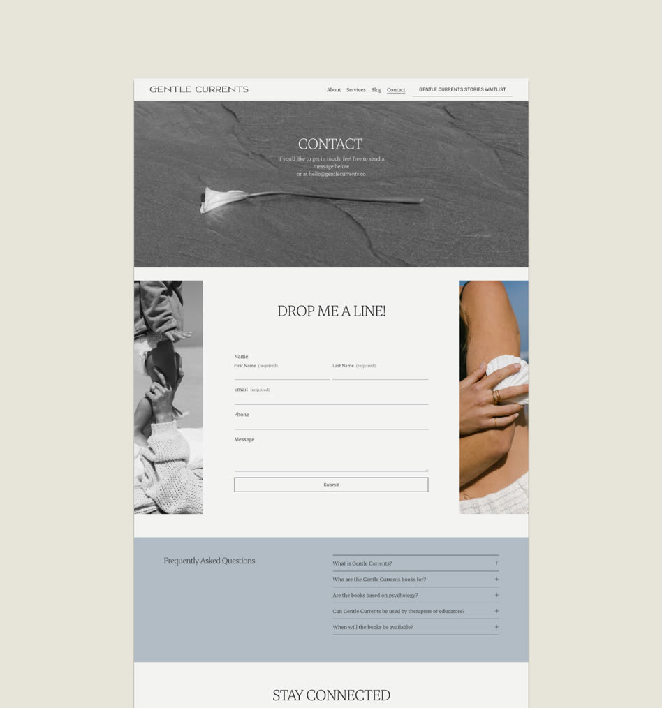
The site opens with one reassuring line, then guides parents through the approach and how to get in touch. A waitlist for the Gentle Currents Stories sits at the heart of the site, alongside parent companion guides, resources for educators and professionals, a shop and a courses page that give Gentle Currents room to grow beyond the books. Generous space, calm photography and a simple contact page make it easy for a parent to take the first step.
What we delivered
FAQ’s
What are the Gentle Currents Stories?
A series of children's books by Keiarna La Carta that help young children understand emotions in a way that feels safe and familiar. Each book uses gentle, nature-based storytelling to explore how feelings move through us and how we find our way back to connection, and is designed for parents and children to read together.
What should a parenting support website include?
A reassuring first line, a clear explanation of your approach, a simple way to get in touch and room for what you offer, like books or courses. Gentle Currents' site has home, about, shop and courses pages, and moves through each slowly and calmly so an overwhelmed parent never feels rushed.
How do you design a brand that feels calming?
Give it space and softness. Gentle Currents uses a muted palette of sage, stone and warm grey, an airy serif, natural textures and plenty of breathing room, so the brand itself feels like a moment of calm.
What does the Gentle Currents logo represent?
The mark is a set of flowing rings, like ripples across water. It echoes the name and the idea at the heart of the practice: when a parent finds calm, it gently spreads to their child.
Other projects

Like what you see?
"She is artistic, logical and can really bring your vision to life in her unique way. It all came together in a week. The templates and process were so supportive."
Book a call