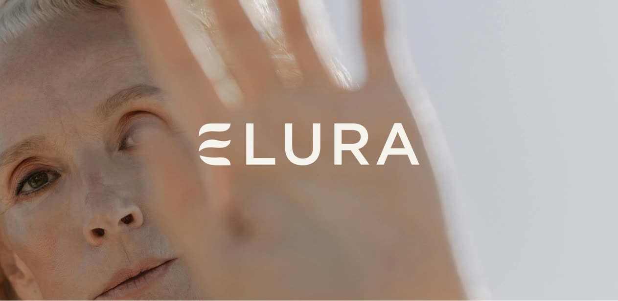
Elura
Brand identity · Website design + build
A brand and website for a midlife women’s health company
Elura helps women in perimenopause and menopause understand what their bodies are doing and what to focus on first, with real clarity instead of quick fixes. Senna Studio created a calm, grounded brand and a website that meets women where they are: feeling off, and wanting to feel like themselves again.
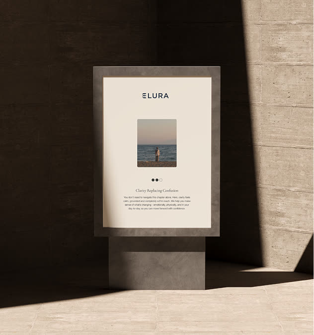
The client
Elura is education and guidance, not mail-order treatment. It helps women make sense of symptoms like brain fog, poor sleep, low energy and mood changes, so they can have better conversations with their own doctors and make changes that last.
The brief
Women’s health is full of loud promises and cold, clinical design. Elura needed to feel trustworthy and warm at the same time: calm enough to reassure, credible enough to trust, and honest that there are no quick fixes.
The brand
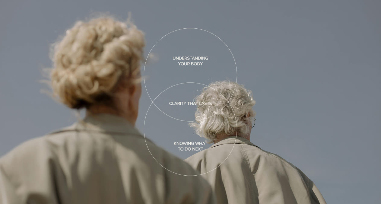
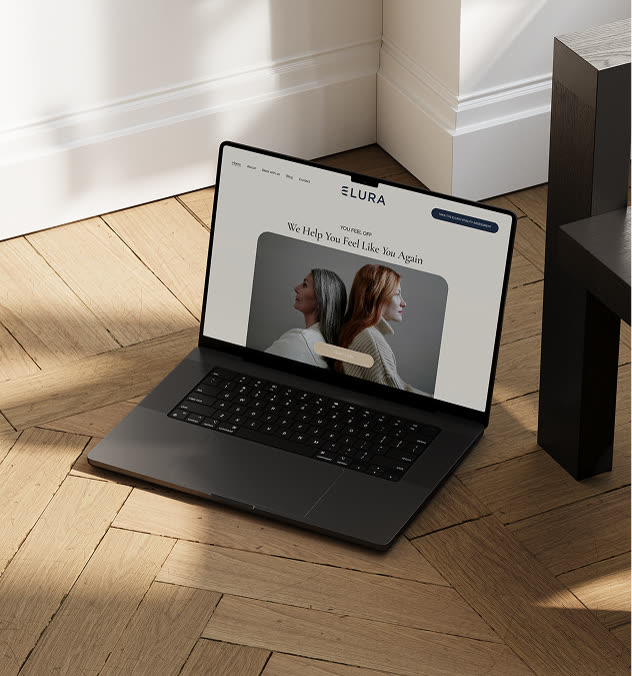
The E is drawn as two soft waves, a nod to the ebb and flow of hormones, and it anchors a light, spaced ELURA wordmark. Navy, sage and soft cream sit alongside misty landscapes and natural portraits of women in midlife, with an elegant serif for headlines that feels reassuring rather than clinical.
The website
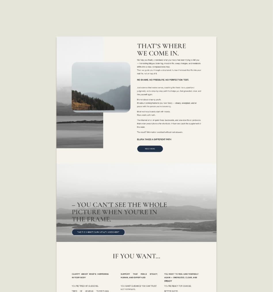
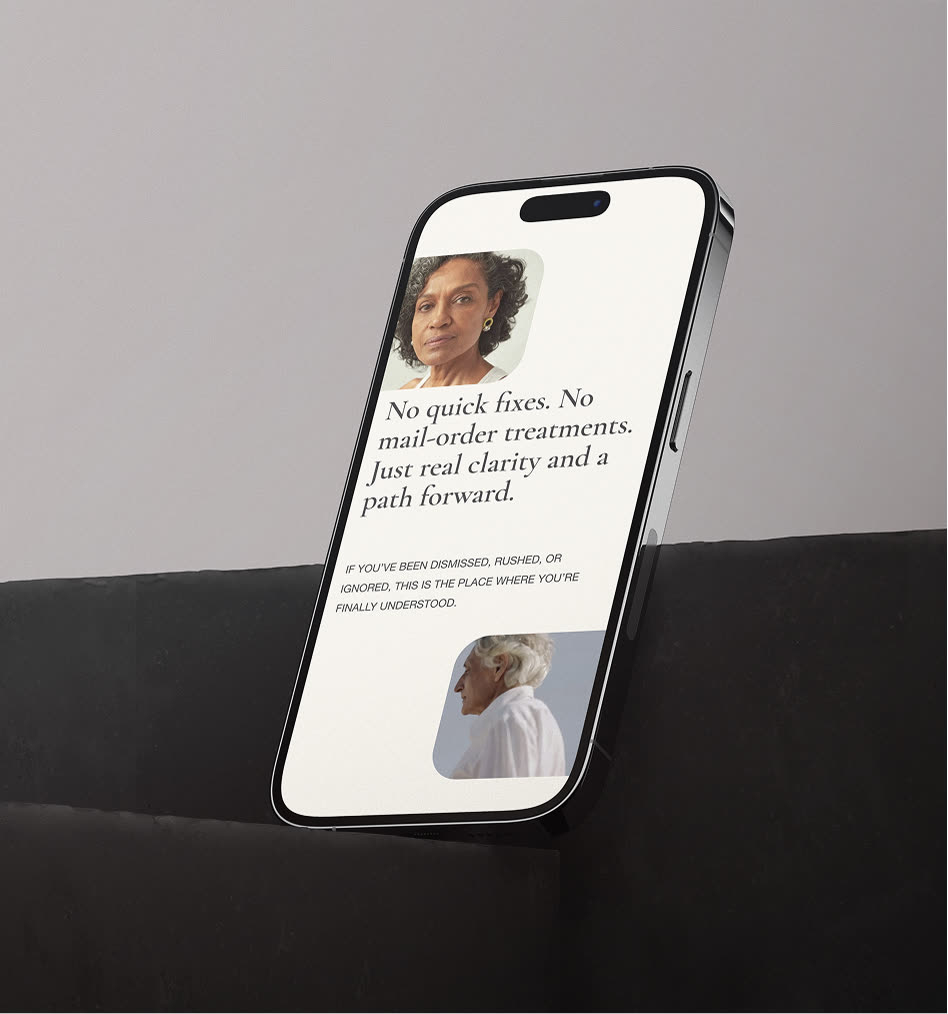
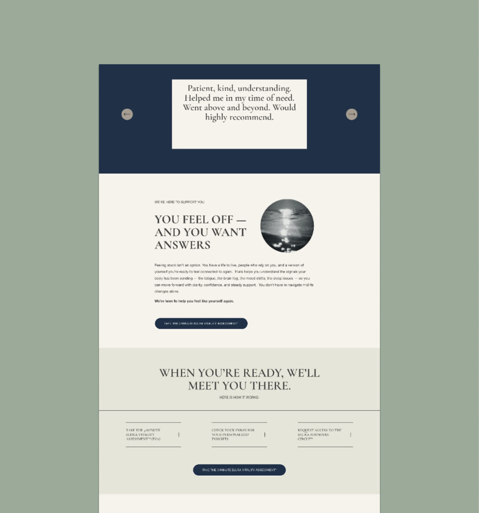
The site leads with how women actually feel, then walks them gently from understanding to action. Clear sections explain the approach, what Elura helps with and what to expect, with lines like “No quick fixes. No mail-order treatments. Just real clarity and a path forward.” It feels just as calm on a phone.


What we delivered
FAQ’s
How do you design a women's health brand that feels trustworthy?
Make it calm rather than loud, and warm rather than clinical. For Elura we used a soft wave-like E symbol, navy, sage and cream, an elegant serif and natural photography of women in midlife, so the brand reassures before it explains.
What should a perimenopause or menopause website include?
Start with how women feel, then explain the approach, what you help with and what to expect next. Elura's site moves gently from understanding to action and is honest that there are no quick fixes.
Why use real-life imagery for a midlife wellness brand?
Women need to see themselves in it. Elura's portraits of women in midlife and its misty, open landscapes make the brand feel personal and grounded rather than glossy.
Other projects
Like what you see?
"She is artistic, logical and can really bring your vision to life in her unique way. It all came together in a week. The templates and process were so supportive."
Book a call