Mastering the Art of Font Pairing on Squarespace and Canva
Grab my free 3 day video email course: FINDING YOUR BRAND COLOURS
In the world of digital design, fonts are more than just letters; they are the voice of your brand. The right font pairing can elevate your brand's aesthetic, while a mismatch can lead to visual discord. For those of us juggling between Squarespace and Canva, consistency in font choices across platforms is key. Let’s dive into the art of font pairing, ensuring your choices are available on both Squarespace and Canva.
Understanding Serif and Sans-Serif Fonts: Before we delve into font pairings, let's understand the basics:
Serif Fonts: These fonts have small lines or strokes attached to the ends of their letters. Think of Times New Roman or Georgia. Serifs are often seen as traditional and elegant, making them a great choice for more formal or classic brands.
Sans-Serif Fonts: "Sans-serif" literally means "without serifs." These fonts, like Arial or Helvetica, have clean lines without additional strokes. They are often viewed as modern and clean, perfect for minimalist or contemporary designs.
The Importance of Cohesive Font Pairing: Your brand's typography is a silent ambassador of your brand. It speaks volumes before a single word is read. Cohesive font pairing across your website and graphic designs ensures a seamless brand experience. Whether it's your website on Squarespace or a social media graphic on Canva, your fonts should tell a consistent story.
Choosing Your Font Duo: When selecting fonts, consider the personality of your brand. Are you modern and minimalist or bold and adventurous? Your fonts should reflect this. A classic serif paired with a clean sans-serif often works wonders for a timeless look. For a more dynamic feel, pair a bold sans-serif with a light script font.
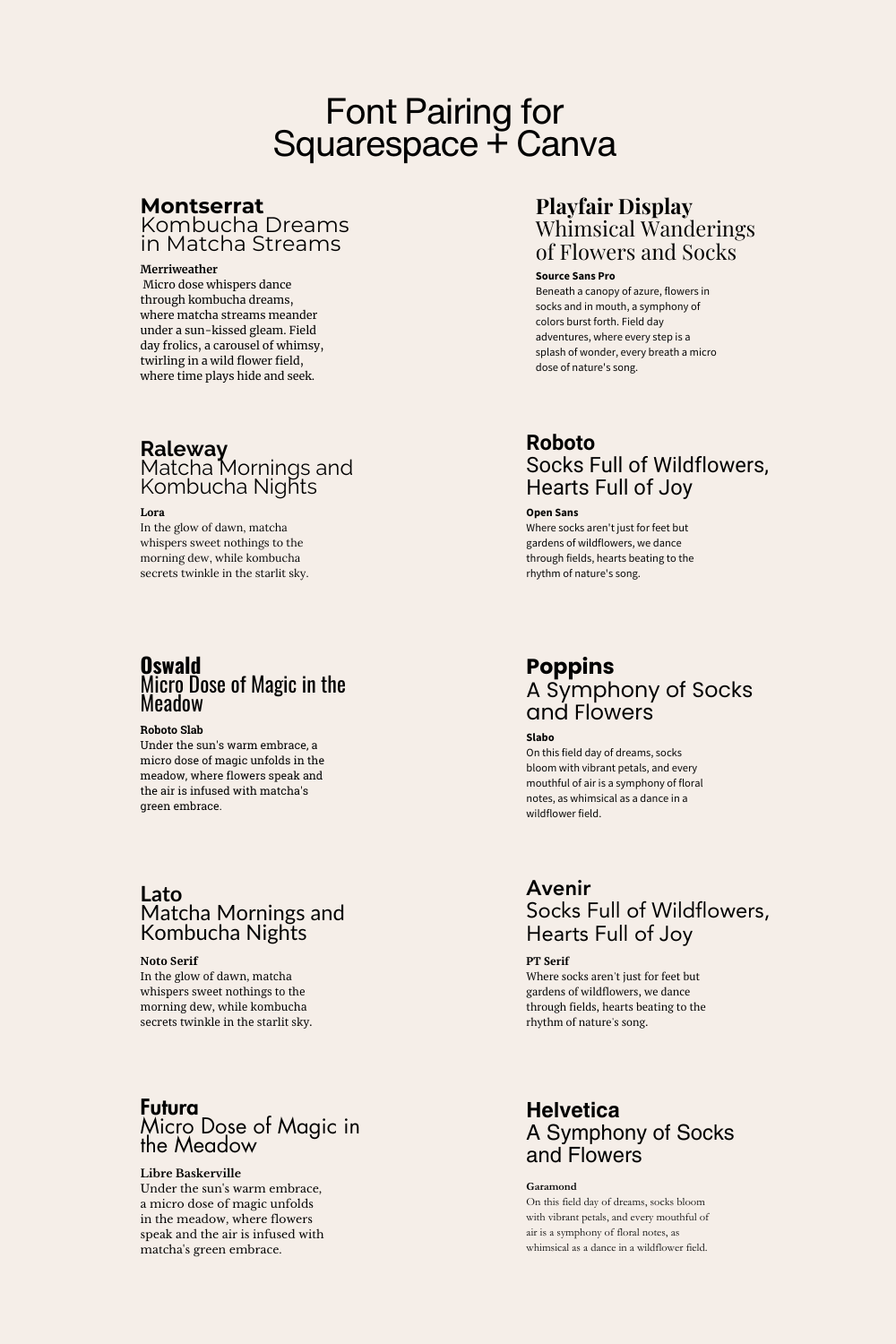
Top Font Pairings for Squarespace and Canva:
Montserrat and Merriweather: Perfect for a modern, clean look.
Playfair Display and Source Sans Pro: Ideal for a sophisticated, editorial vibe.
Raleway and Lora: For a touch of elegance.
Roboto and Open Sans: A minimalist, contemporary brand's dream.
Oswald and Roboto Slab: Oswald's strong presence pairs well with the sturdy structure of Roboto Slab.
Poppins and Slabo: Poppins' rounded form complements Slabo's more angular serifs.
Lato and Noto Serif: Lato's balanced sans-serif pairs nicely with the refined Noto Serif.
Avenir Next and PT Serif: Avenir Next's clean lines work well with PT Serif's traditional feel.
Futura and Baskerville: Futura's geometric style contrasts beautifully with Baskerville's classic serifs.
Helvetica Neue and Garamond: A timeless combination of modern and classic.
Tips for Font Pairing:
Contrast is Key: Combine a serif with a sans-serif to create visual interest.
Consistency Across Platforms: Ensure your chosen fonts are available on both Squarespace and Canva for brand consistency.
Legibility Matters: Always prioritize readability, especially for your main body text.
Less is More: Stick to two or three fonts to avoid overwhelming your design.
Font pairing is an essential aspect of your brand's visual identity. By choosing the right fonts that are available on both Squarespace and Canva, you create a harmonious and professional look across all your digital platforms. Remember, the right fonts not only convey your message but also amplify it.
Tip: Try flipping the fonts, so that the paragraph becomes your headers. Have a play!
Amy Ilic
Squarespace Designer & Brand Conjuror

